Announcement

Collapse
No announcement yet.

Please give me honest opinions on this CD cover.

Collapse
X
 
  • Filter
  • Time
  • Show
Clear All
new posts

  • Please give me honest opinions on this CD cover.

    My solo project. It's stoner/doomish stuff I've been working on.

    I'd like to hear your opinions on the CD cover art.

    Sleep!!, That's where I'm a viking!!

    http://www.myspace.com/grindhouseadtheband

  • #2
    i like it all ( the contrast between the green and purple is awesome)

    but you need to change the font ( unless thats your logo) i just dont think it fits
    Say, I smell bacon.Does anyone else smell bacon?
    Yeah, I definitely smell a pork product of some type.

    Comment


    • #3
      ZOMG OCTOPIIII!!!!! *does octopus dance in between snare hits *


      ss is right, the logo doesn't go with that art

      Comment


      • #4
        The picture is cool but I agree with the other 2. New font for that image...
        I'm angry because you're stupid

        Comment


        • #5
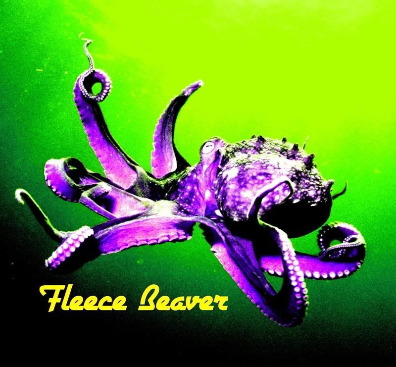
          The green to black transition could be bit smoother, aka not so much damn green(yellow) in the upper right corner. I think if you gave the octopus a black border and dropped the "Fleece Beaver" into the lower left-hand corner (the black) it would help a lot.
          Last edited by anuske9; 01-24-2008, 03:49 PM.
          -Adam

          Comment


          • #6
            +1000 to the above posts. The band logo has to change.
            Scott

            Comment


            • #7
              Crap font, and why isn't the octopus holding a spliff?
              Fwopping, you know you want to!

              VI VI VI: the editor of the Beast!

              There are 10 kinds of people who understand binary. Those who do and those who don't.

              Comment


              • #8
                It's okay to me. I'd rather hear the music, though.
                I feel my soul go cold... only the dead are smiling.

                Comment


                • #9
                  Okay, I'll try some different fonts. I don't have a logo, I just wanted some corny looking font that looked sorta out of place, but I'll try some more.
                  Sleep!!, That's where I'm a viking!!

                  http://www.myspace.com/grindhouseadtheband

                  Comment


                  • #10
                    I like it.... Font and all....
                    "Now remember, things look bad and it looks like you're not gonna make it, then you gotta get mean. I mean plumb, mad-dog mean. 'Cause if you lose your head and you give up then you neither live nor win. That's just the way it is. ":JOSEY WALES

                    Comment


                    • #11
                      Just do the cover totally black, like a cloud of octopus ink, with just a pair of eyes visible.

                      And maybe just one octopus testicle.


                      I mean tentacle.


                      Although, thinking about it.........
                      So I woke up,rolled over and who was lying next to me? Only Bonnie Langford!

                      I nearly broke her back

                      Comment


                      • #12
                        What about this font?

                        Sleep!!, That's where I'm a viking!!

                        http://www.myspace.com/grindhouseadtheband

                        Comment


                        • #13
                          That octopus needs to be wrestling a big hookah. (That's a big water pipe, not a large prostitute)

                          Or maybe a set of bagpipes (Complete with the tag-line, "It's not trying to play it, it's trying to get its knickers off")

                          That font looks too Happy Mondays Mancunian to me.
                          So I woke up,rolled over and who was lying next to me? Only Bonnie Langford!

                          I nearly broke her back

                          Comment


                          • #14
                            I think something handwritten would be better, or at least some text that isn't on a straight line. I do like the red/green better than the green/purple.
                            Scott

                            Comment


                            • #15
                              I still kinda prefer the first one. It looks "accidental"
                              Sleep!!, That's where I'm a viking!!

                              http://www.myspace.com/grindhouseadtheband

                              Comment

                              Working...
                              X